


In display manufacturing, transparency is often misunderstood.
Many buyers, especially those new to retail fixtures or visual merchandising, believe that a clear display stand automatically feels modern and high-end. The logic seems reasonable at first glance. Transparent materials look clean. They don't block the product. They feel "designed" rather than decorative.
Yet in real retail environments, transparent stands are also the ones most likely to look cheap.
This is not a contradiction. It is a consequence of how transparency behaves in physical space.
The First Misjudgment: Treating Transparency as a Finish
One common mistake is assuming transparency works like a surface treatment.
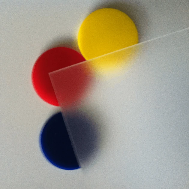
Buyers may compare transparent stands the same way they compare colors or textures: clear versus black, frosted versus glossy. But transparency is not a surface choice. It is a condition that exposes everything beneath and within the structure.
Opaque materials forgive. Transparent materials do not.
In metal or MDF stands, internal structure, uneven joints, or minor alignment issues can be hidden. In transparent materials, the structure is the appearance. Every decision becomes visible.
This is why two clear stands with similar shapes and dimensions can feel completely different in quality.

"Clear" Is Not a Material Specification
Another source of confusion is how loosely the word "transparent" is used.
In practice, transparent display stands can be made from cast acrylic, extruded acrylic, PC, PET, PVC, or blended plastics. On a quotation sheet, these materials may all appear acceptable. On a shop floor, they behave very differently.
Low-grade acrylic often looks fine in photos but shows internal haze under store lighting. PVC can appear overly glossy and plasticky, especially when thin. PET bends easily, which immediately reduces perceived strength.
High-grade cast acrylic has depth. It reflects light evenly and maintains visual neutrality. The difference is subtle, but customers notice it subconsciously.
When buyers specify "transparent" without locking down material grade, the outcome is often a stand that technically meets the requirement but visually falls short.
Not sure which transparent material fits your project? Let us recommend the right grade for you-just send your inquiry.


Thin Panels Send the Wrong Message
Weight matters, even when the structure is visually light.
In premium transparent displays, panels are often thicker than strictly necessary for load-bearing. This is intentional. The added thickness stabilizes the structure and changes how it feels when touched.
Many low-cost transparent stands use minimal thickness to reduce material usage. The stand may not break, but it flexes slightly. Shelves vibrate. Vertical panels feel unstable.
Customers do not analyze thickness in millimeters. They react to movement. Any unnecessary movement signals fragility, and fragility is the opposite of premium.


Edge Quality Is Where Most Transparent Stands Fail
If you want to identify a low-quality transparent stand quickly, look at the edges.
Rough-cut or lightly polished edges scatter light and appear cloudy. Flame polishing done too quickly leaves distortion. In some cases, edges are sharp enough to feel uncomfortable.
In higher-end projects, edges are treated as a design element. Diamond polishing or controlled flame finishing produces smooth, glass-like lines that catch light cleanly.
Edges are usually at eye level. They are also often touched during product interaction. This makes them one of the most critical yet underestimated details in transparent displays.

Bonding Reveals the True Cost Strategy
Bonding methods are rarely discussed during early quotation stages, but they play a decisive role in how a transparent stand looks.
Manual gluing is cheap and fast. It is also highly dependent on operator skill. Glue lines, trapped air bubbles, and inconsistent joints are common.
UV bonding and CNC jointing produce much cleaner results. They also require better design preparation, skilled labor, and slower production cycles.
In opaque stands, bonding shortcuts may go unnoticed. In transparent stands, they become the first thing people see.
This is why some transparent displays look "unfinished" even when the design itself is simple and functional.
Looking for clean, high-quality bonding for your transparent stands? Send us your project details for a customized solution.

Structural Logic Still Needs to Be Visible
Transparency removes visual mass. That does not mean structure should disappear.
Well-designed transparent stands guide the eye. Load-bearing elements are positioned where the brain expects support. Even without understanding engineering, viewers feel that the stand is stable.
Poor designs ignore this psychological factor. Shelves appear to float without explanation. Vertical panels look too thin to support weight. The result is discomfort.
When customers doubt the stand's strength, they also doubt the product's value. This reaction happens quickly and without conscious thought.

Environment Can Make or Break Transparency
Transparent stands are highly sensitive to their surroundings.
In clean, controlled retail spaces with balanced lighting, transparency works in favor of the product. In crowded stores with mixed materials, reflections and glare multiply.
Fingerprints, dust, and micro-scratches become visible faster on clear surfaces than on opaque ones. What looked minimal at installation can look neglected within weeks.
This is why transparent displays perform best in environments where maintenance standards match design ambition.

Overexposed Gloss Often Feels Cheap
Glossy transparency is not always the right choice.
Many low-cost transparent stands use untreated glossy surfaces because they are easier to produce. Under strong lighting, these surfaces reflect everything, including cables, shelf edges, and background clutter.
More refined projects often introduce partial frosting, matte finishes, or textured zones. These treatments reduce glare and add visual depth.
Interestingly, reducing transparency in certain areas often improves the overall perception of quality.
Want to add visual depth to your transparent displays? Inquire now to explore frosting and matte finish options.
Hardware Is Never Invisible in Clear Structures
Screws, magnets, LED modules, and wiring become part of the design when the structure is transparent.
Generic fasteners that work fine in metal or MDF stands often look crude behind clear panels. Poor cable management immediately breaks the illusion of cleanliness.
In premium transparent displays, hardware is integrated early in the design stage. In cheaper ones, it is added later-and transparency ensures that the compromise is visible.

Time Is the Final Judge
Transparent displays reveal aging faster than opaque ones.
Scratches, yellowing, and internal stress lines appear sooner in low-grade materials. What looked acceptable during installation may look worn within a single season.
Better material choices, thicker panels, and replaceable components cost more upfront, but they age more gracefully.
In retail, a stand that looks tired makes the product look outdated, regardless of how new it actually is.
When Transparency Actually Works
Transparent display stands look premium only when transparency is treated as a responsibility rather than a shortcut.
They work when:
Material grade is selected intentionally
Thickness supports perception, not just load
Edges and joints are finished properly
Structure communicates stability
The retail environment supports clarity
Without these conditions, transparency simply exposes compromise.
Transparency Is Honest
Transparent materials do not create quality. They reveal it.
A clear display stand that looks cheap is rarely the result of a single mistake. It is usually the accumulation of small cost-driven decisions that transparency refuses to hide.
In this sense, transparency is not decorative. It is honest. And in retail, honesty can either reinforce a brand-or quietly undermine it.
Mastering the core logic of transparent display quality, we solve common pain points like haze, unstable structure, and shoddy bonding. Need cost-effective & premium transparent display fixtures? Send us your inquiry now, and we'll reply with quotes, samples, and technical parameters promptly.